Anteaox
Packaging refresh for a science-led wellness blend
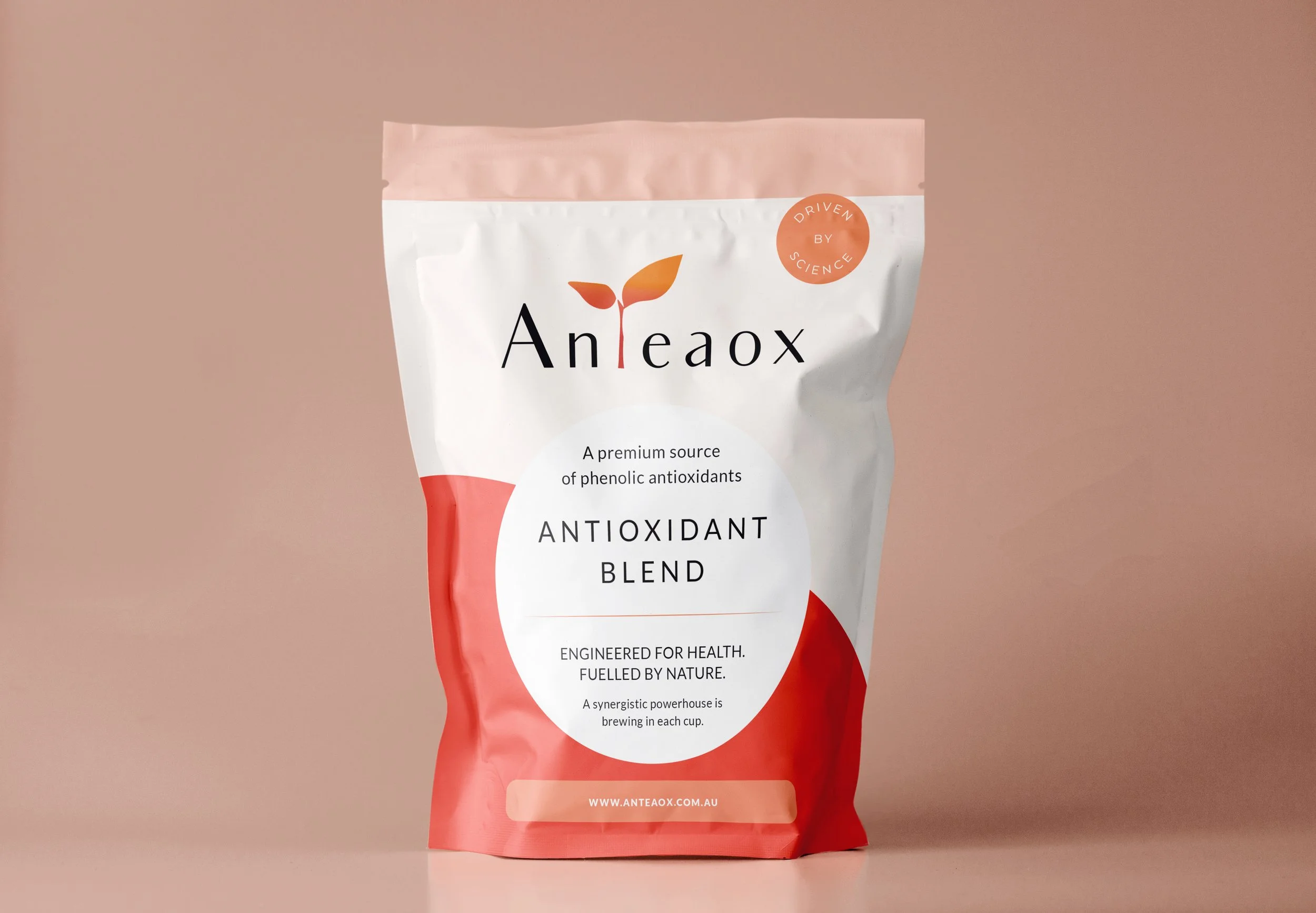
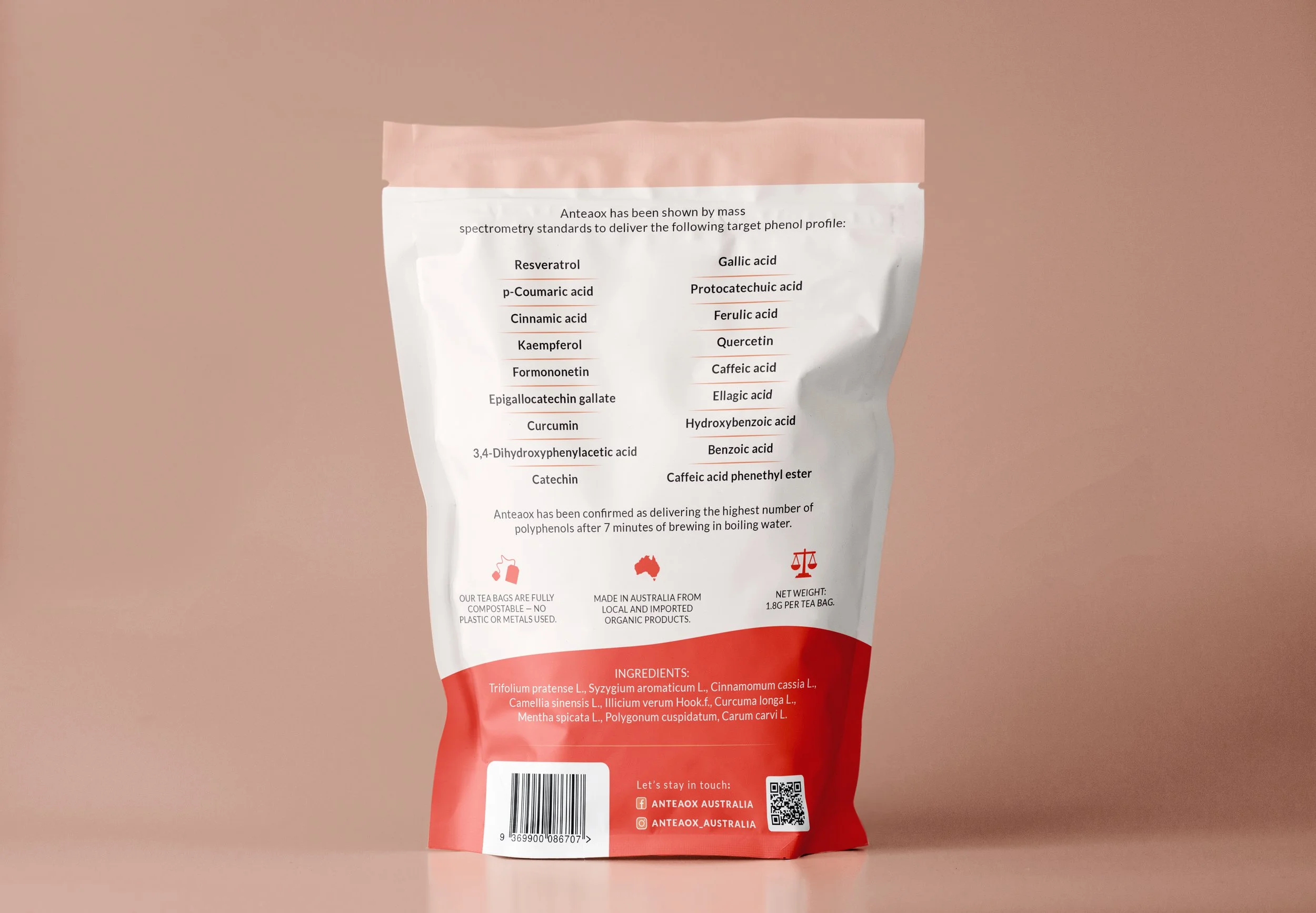
Anteaox came to QUIRK with an existing product and a clear point of difference, but the packaging wasn’t reflecting the quality of what was inside. We refreshed the pack to feel more premium, more credible, and more aligned with the brand’s science-backed positioning — while keeping the product approachable and natural.
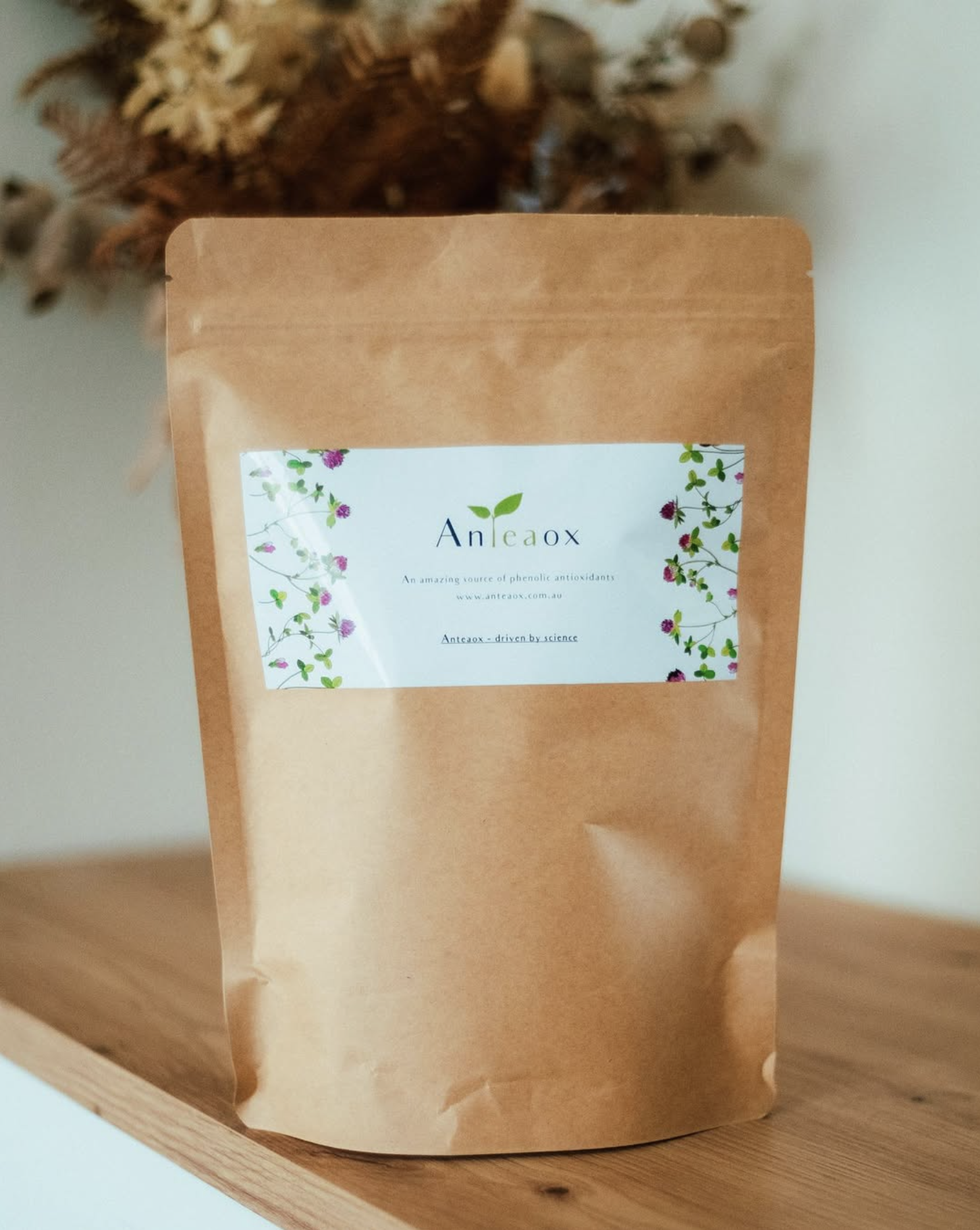
Before
The original packaging didn’t fully reflect the quality of the product inside. The existing pouch felt too homemade for a science-led wellness blend, making it harder to communicate trust, clarity, and premium value at first glance.
What we did
A packaging refresh focused on front and back pouch design, visual hierarchy refinement, and print-ready artwork.
The result
The refreshed packaging helped reposition Anteaox as a more premium, credible product, with a visual identity that better reflects its functional benefits and quality ingredients.
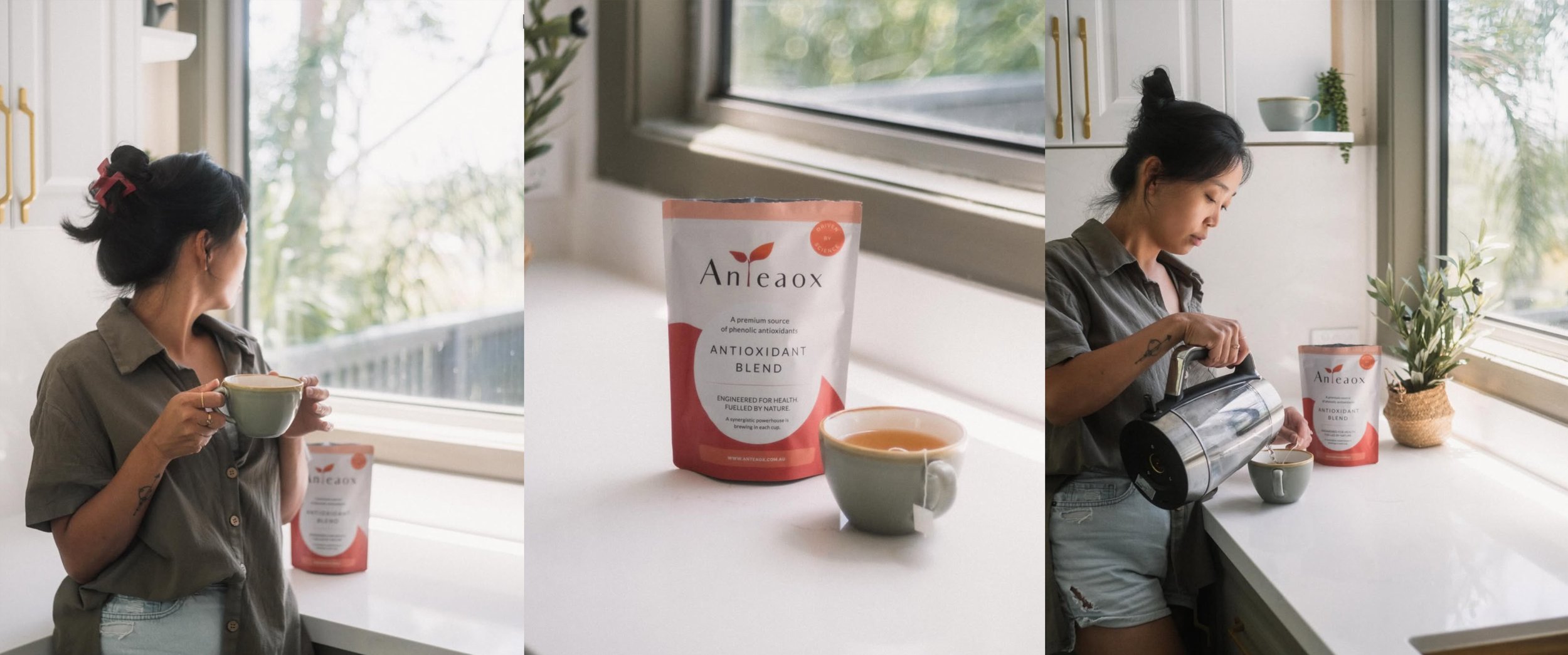
The brand has since used the updated packaging across product photography and social content, creating a stronger and more cohesive brand presence across customer touchpoints.