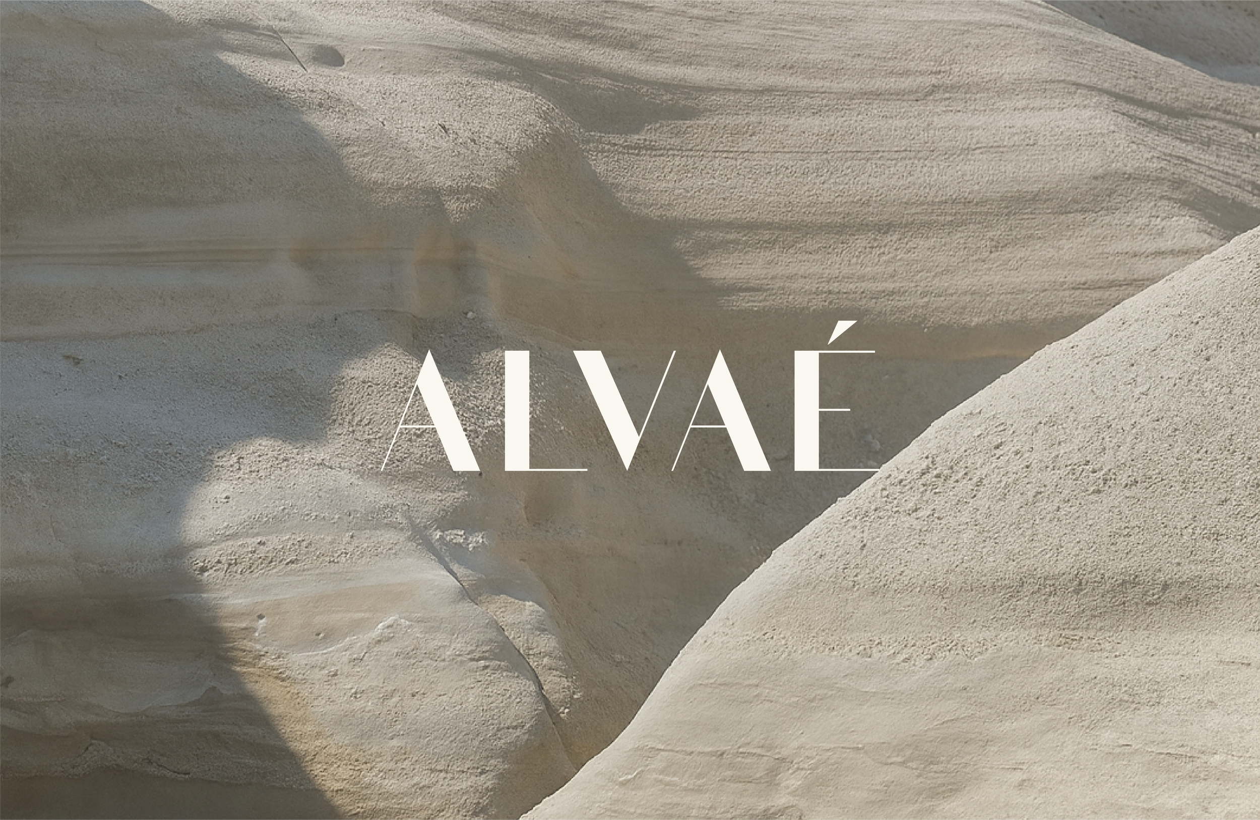
ALVAÉ
Brand identity for a conscious cleaning brand
Alvaé came to Quirk with a name already in place and a clear ambition: to create a cleaning brand that felt calmer, more considered, and more at home in a beautifully designed space. We developed an identity that softened the category and gave the brand a sense of quiet confidence.
A softer take on the category
In a category often shaped by bright colours, hard-working claims, and purely functional design, Alvaé needed a different kind of presence.
The goal was to create a brand identity that still felt clean and effective, but with a more elevated, lifestyle-led point of view. Minimal, grounded, and quietly premium - a brand designed to sit naturally in the home, not fight for attention in it.
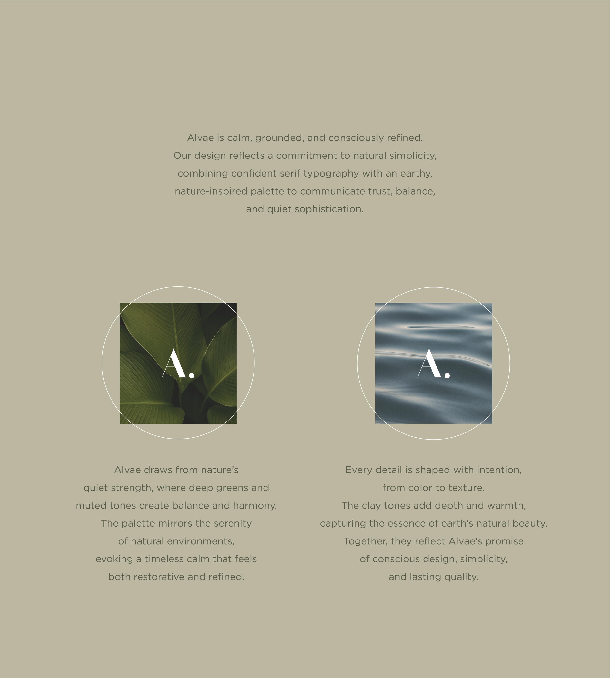
Building the brand world
We started by defining the emotional world around the brand.
The direction was shaped by calm, grounded refinement - drawing on natural cues, muted tones, and a more restrained visual language. Rather than leaning into the usual codes of the cleaning category, we wanted Alvaé to feel restorative, balanced, and intentionally designed.
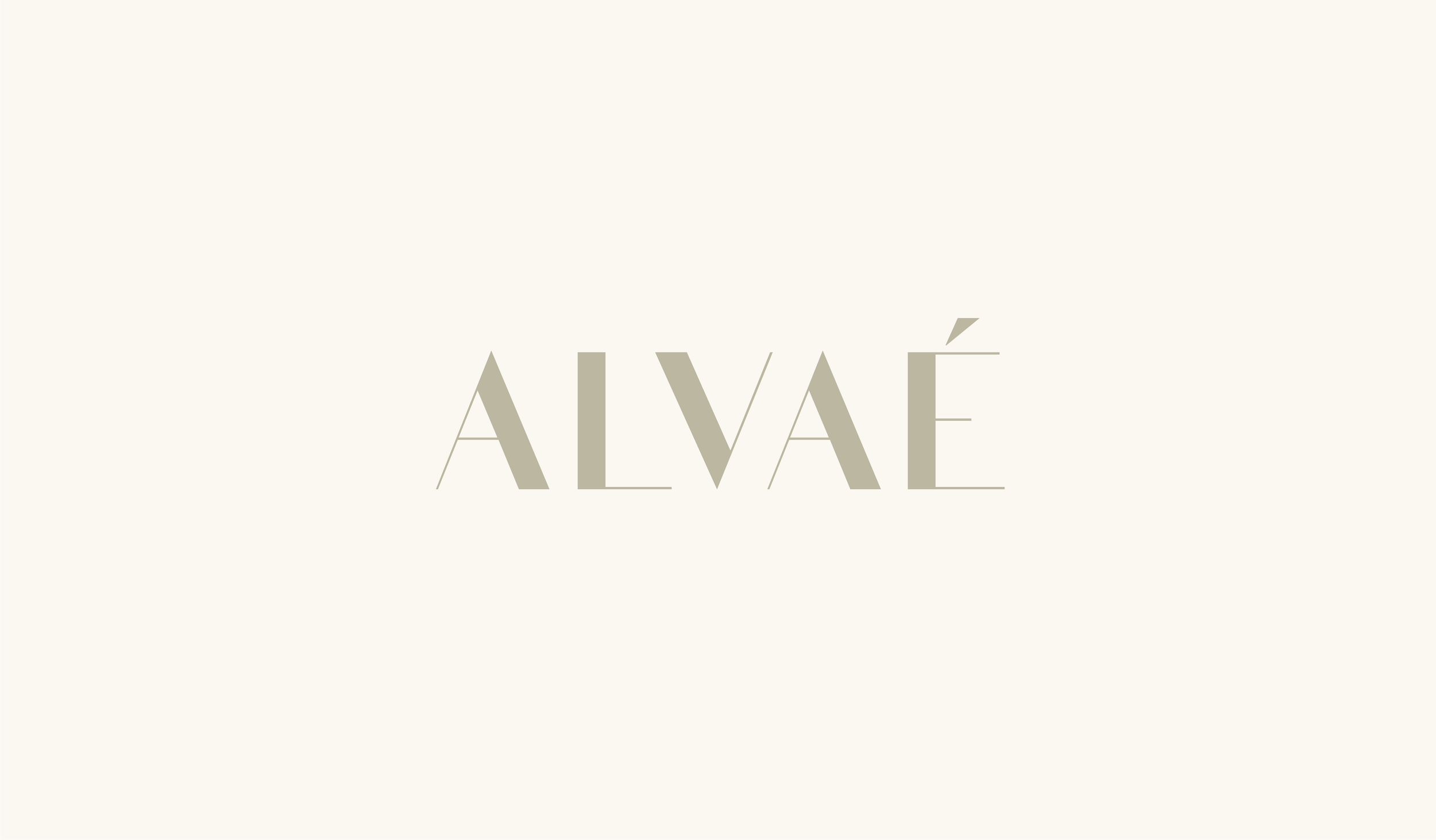
A minimal identity with quiet presence
The final identity balances softness and structure.
We paired a refined wordmark with a simple monogram mark to create a system that feels elegant, modern, and easy to apply across different touchpoints. The visual language stays understated, but still distinctive, giving the brand enough character to feel memorable without losing its calm, pared-back quality.
The result is an identity that feels considered rather than decorative, and premium without trying too hard.
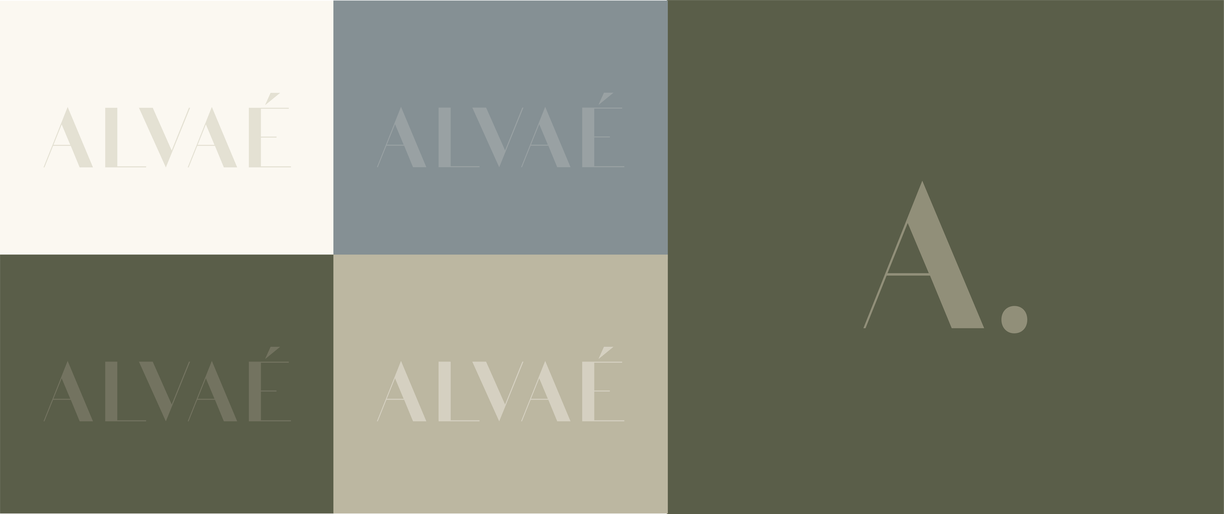
Designed to feel grounded, clean, and refined
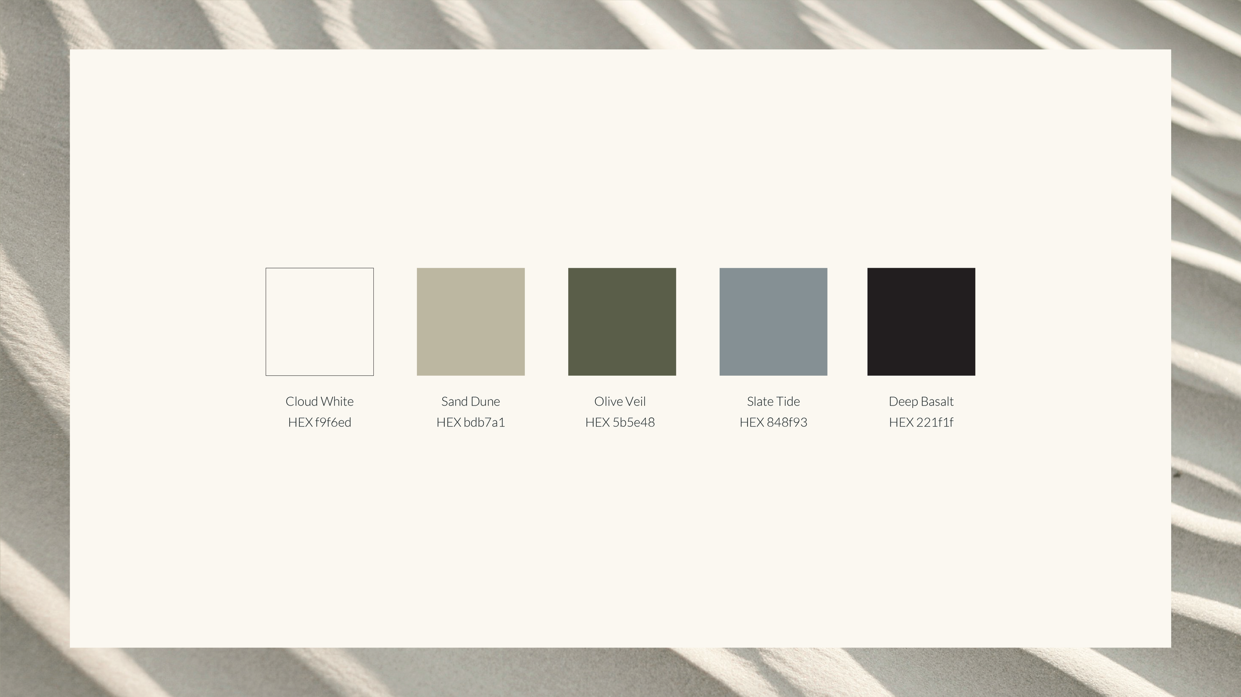
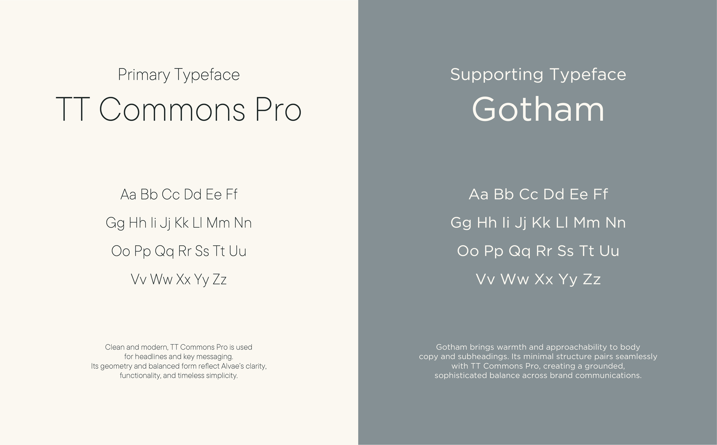
The colour palette draws from natural materials and quiet interiors, combining soft neutrals, olive tones, and deeper grounding shades to create a sense of calm and balance. The typography pairing brings that same balance, mixing clarity with warmth to keep the brand feeling both polished and approachable. Alvaé Branding FInal
Together, these elements give Alvaé a visual language that feels timeless, minimal, and naturally at ease in the home.
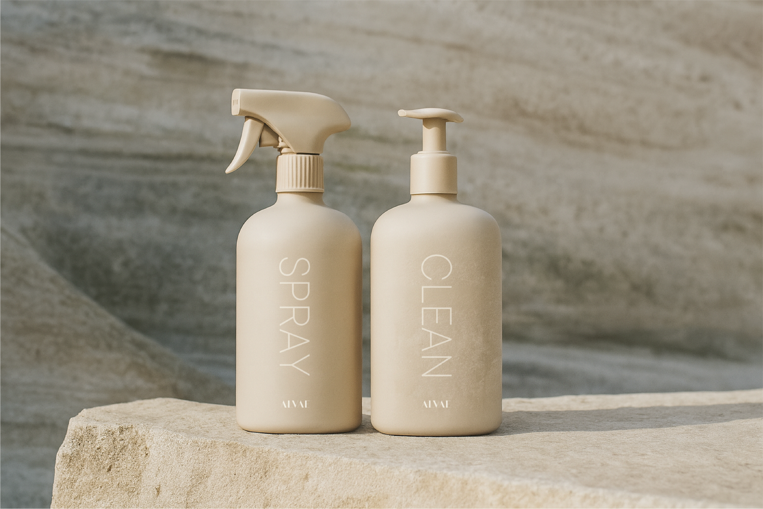
Designed to live beautifully in the home
Alvaé was designed to feel less like a traditional cleaning product and more like a considered object within the home.
The packaging concept extends the identity into a soft, minimal form that feels calm, elevated, and intentionally understated. Rather than something to hide away under the sink, it was imagined as a product that could sit proudly on a shelf or benchtop - blending naturally into the space while still feeling functional, clear, and effective.
The result
Alvae now has a brand identity that feels calm, clear, and confidently understated.
A softer, more elevated take on eco cleaning. Designed to build trust, sit beautifully in the home, and give the brand a strong visual foundation as it grows.