Stellar Baby came to us with a deeply personal mission: create a baby tech brand that feels calm, confident, and genuinely supportive for parents. We developed the brand from the ground up, shaping not just how it looks, but how it speaks. From visual identity and brand personality to tone of voice, messaging, and launch-ready creative, this was a full brand world built to help parents feel one thing above all: peace of mind.
Brand strategy, identity, and tone of voice for a baby tech startup built around peace of mind.
What we created
Brand personality and positioning
Tone of voice and messaging system
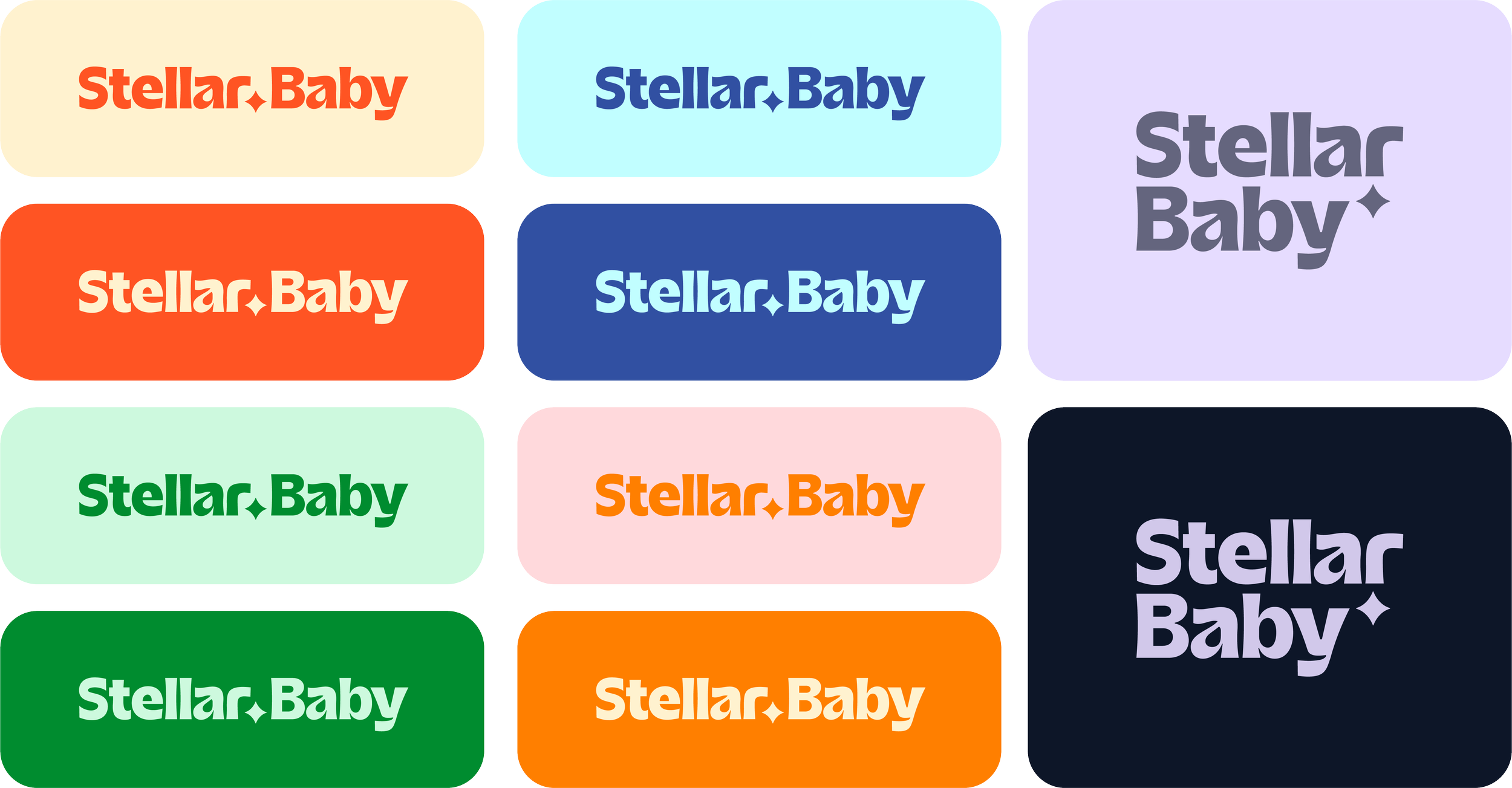
Visual identity and logo suite
Colour, typography, and brand assets
App-ready digital brand elements
Launch-ready creative direction
More than a visual identity
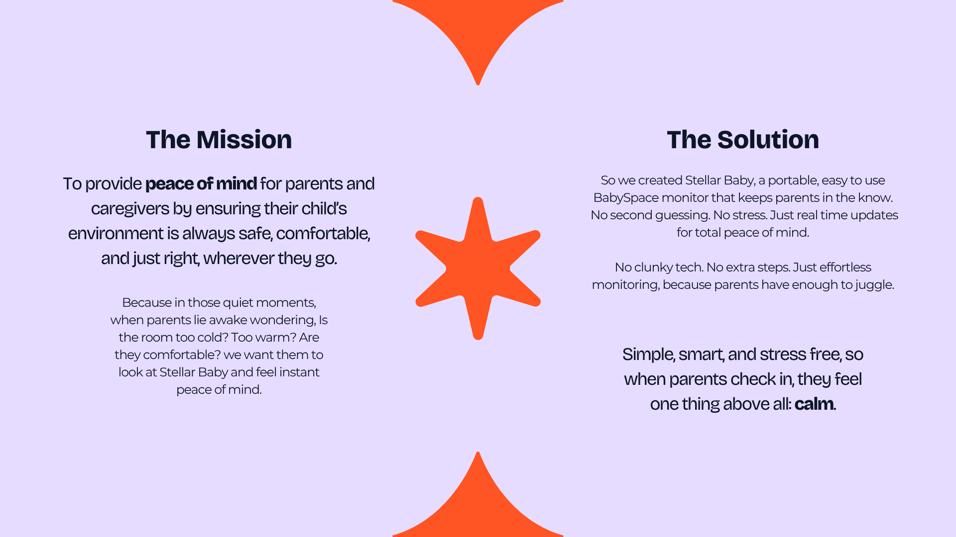
Stellar Baby was one of those projects where the brand needed more than just a logo. It needed a personality. A voice. A way to connect with parents that felt emotionally real, while still clearly communicating a product built around smart baby monitoring.
Alongside the visual identity, we developed a full tone of voice system that defined how the brand should speak across social, packaging, customer support, app messaging, and launch content. That meant shaping not just the look of the brand, but the language behind it too.

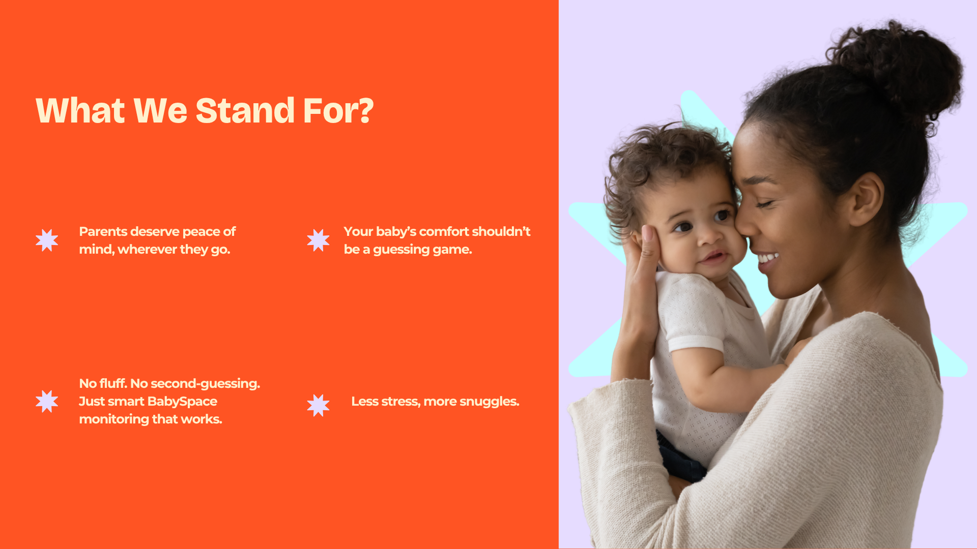
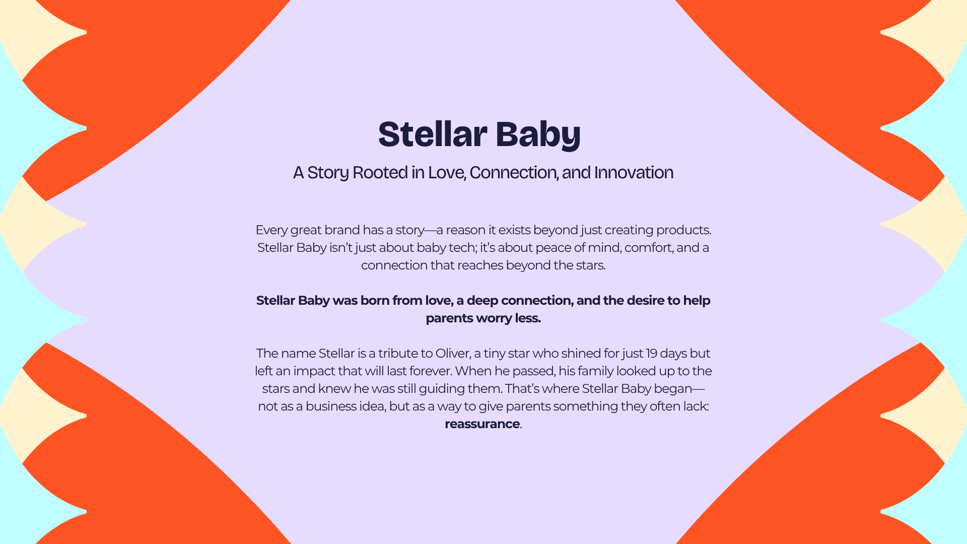
At the heart of Stellar Baby is a deeply personal story. The brand wasn’t built to follow the usual baby category playbook of pastels, clichés, and overly sweet baby talk. It was built around reassurance. Calm. Clarity.
The goal was to create a brand that feels vibrant, emotionally grounded, and easy to connect with, while still making the product feel simple, trustworthy, and easy to understand.
A baby tech brand built from something deeper
A bold identity for parents
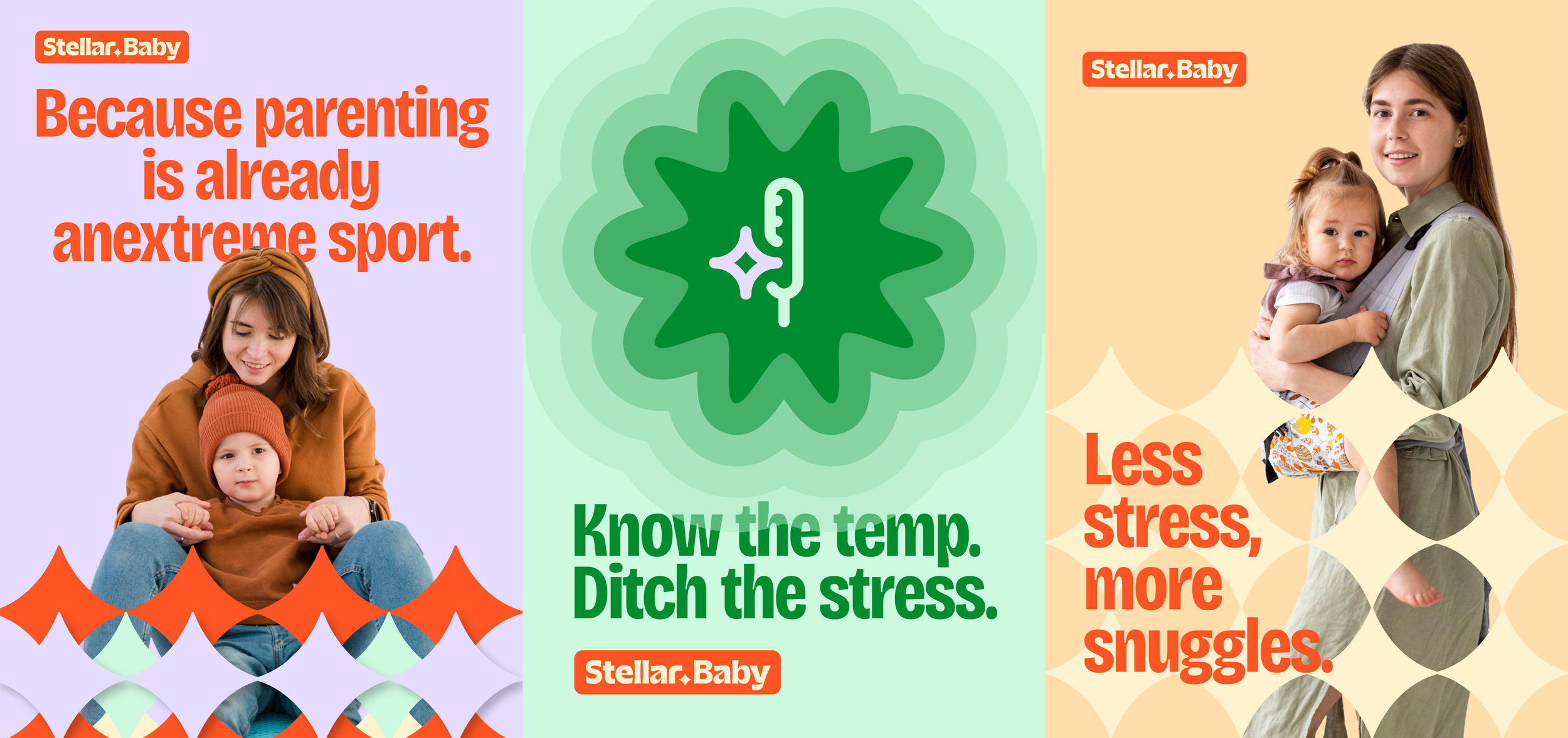
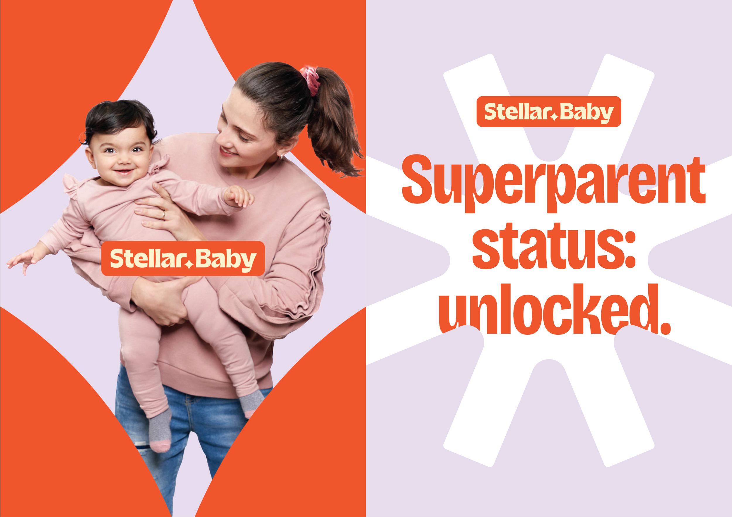
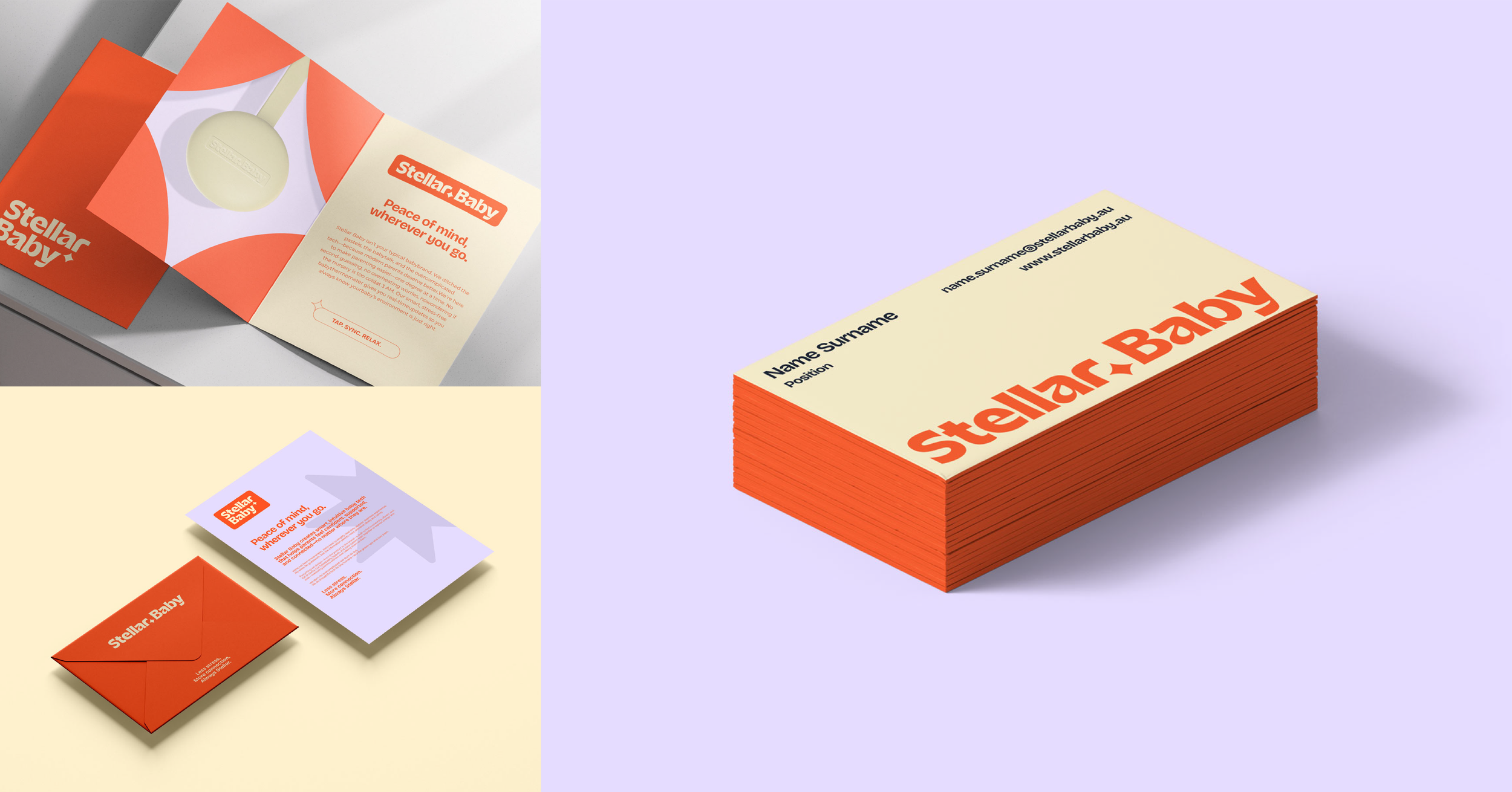
We created a visual identity that feels instantly recognisable and intentionally different from the typical baby category. The system balances warmth with confidence, using a bold typographic logo, vibrant colour palette, playful star motifs, and a flexible set of brand assets designed to work across digital, packaging, and future product touchpoints.
The result is a brand that feels energetic, clear, and modern, without losing the emotional softness the category needs.
Built for digital from day one
Because Stellar Baby is a tech-led product, the brand needed to feel just as strong in digital as it does across traditional brand touchpoints. We developed app-ready brand elements designed to carry the identity seamlessly across mobile touchpoints, from the app icon and UI-inspired assets to flexible layouts built for future digital use.
The result is a brand system that feels considered beyond the logo, with the flexibility to show up confidently wherever the product lives.
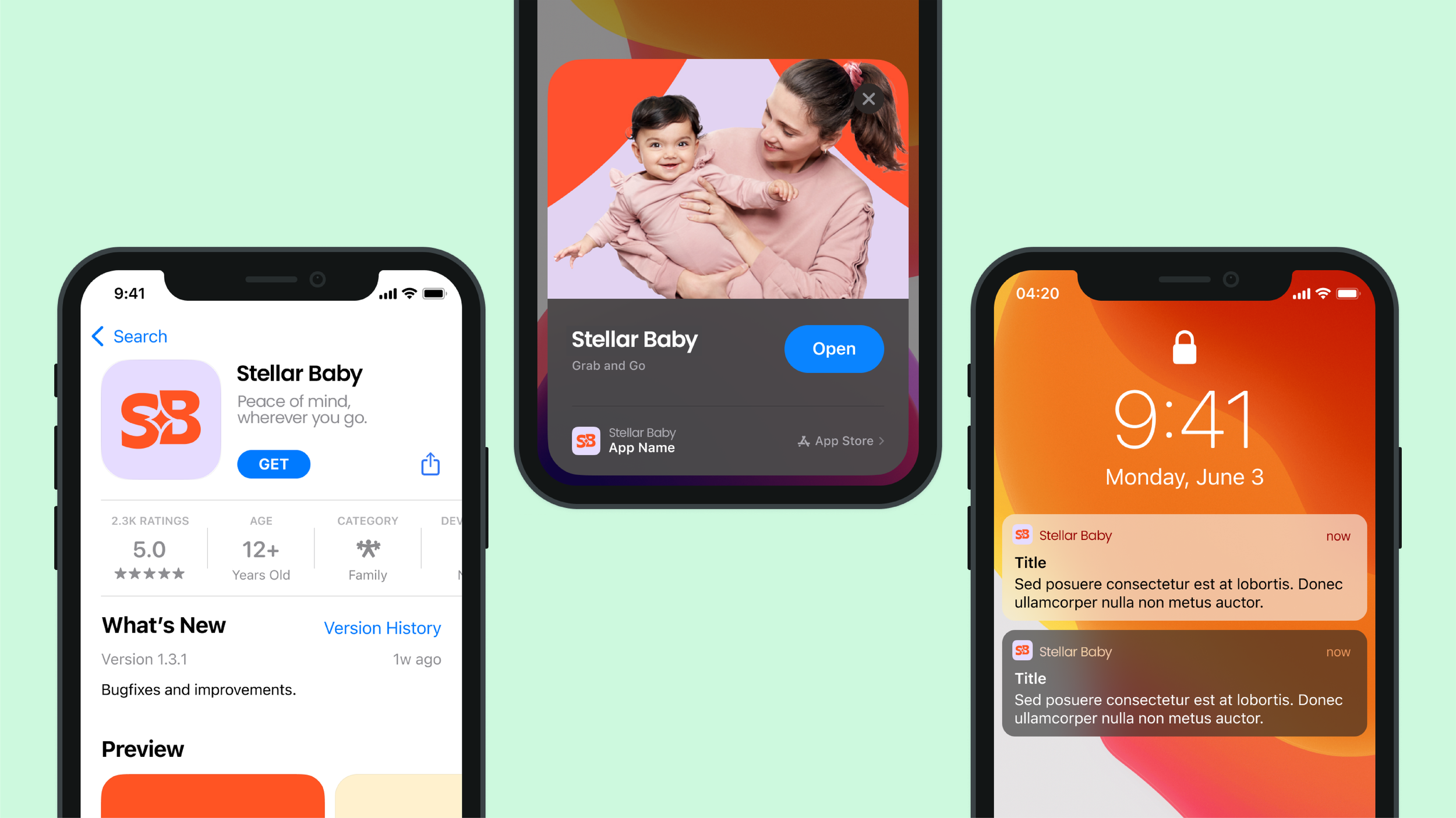
Illustration with warmth and personality
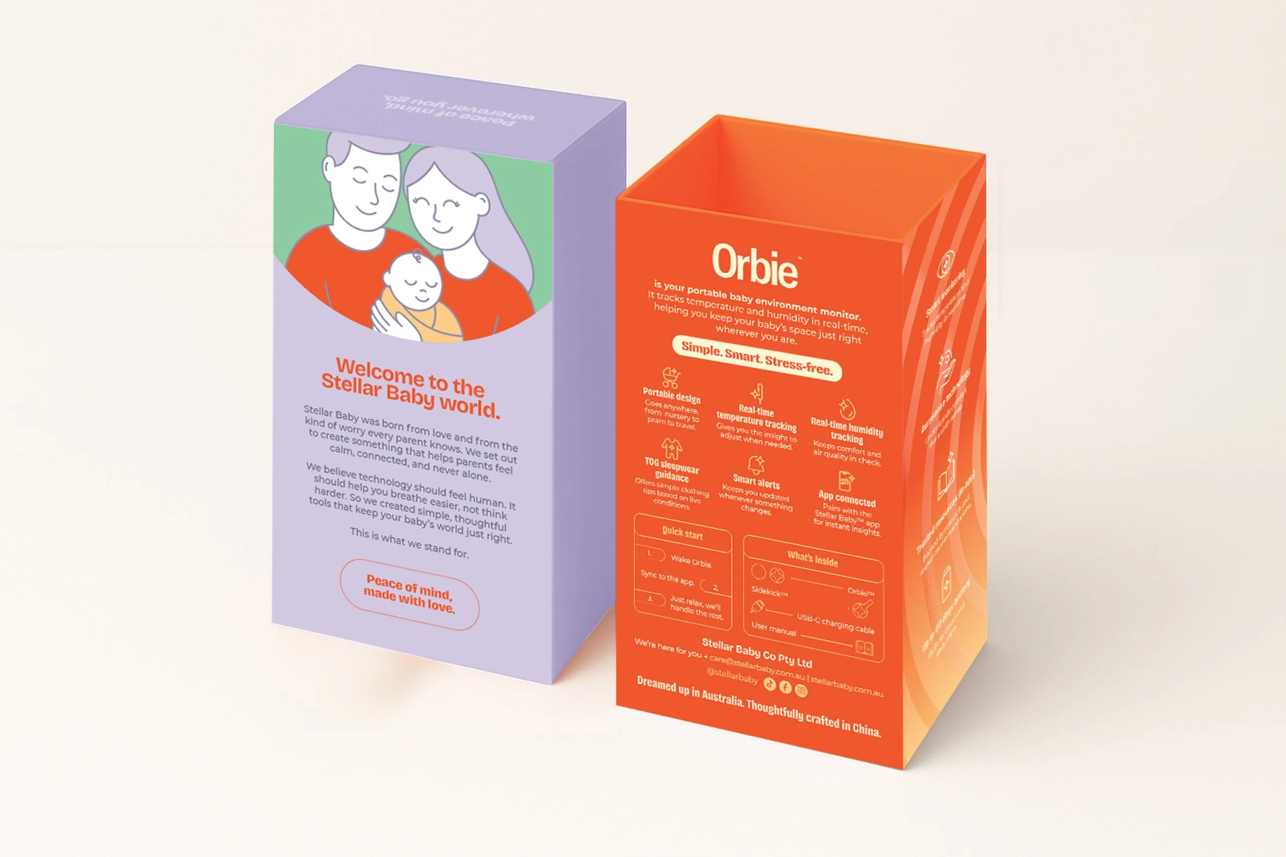
To support the brand’s more playful and expressive side, we developed a simple illustration style that adds personality without distracting from the product itself. These assets bring warmth, recognisability, and a more human layer to the brand, especially across digital touchpoints and future customer-facing content.
Used selectively, the illustrations create moments that feel light, friendly, and unmistakably Stellar Baby.


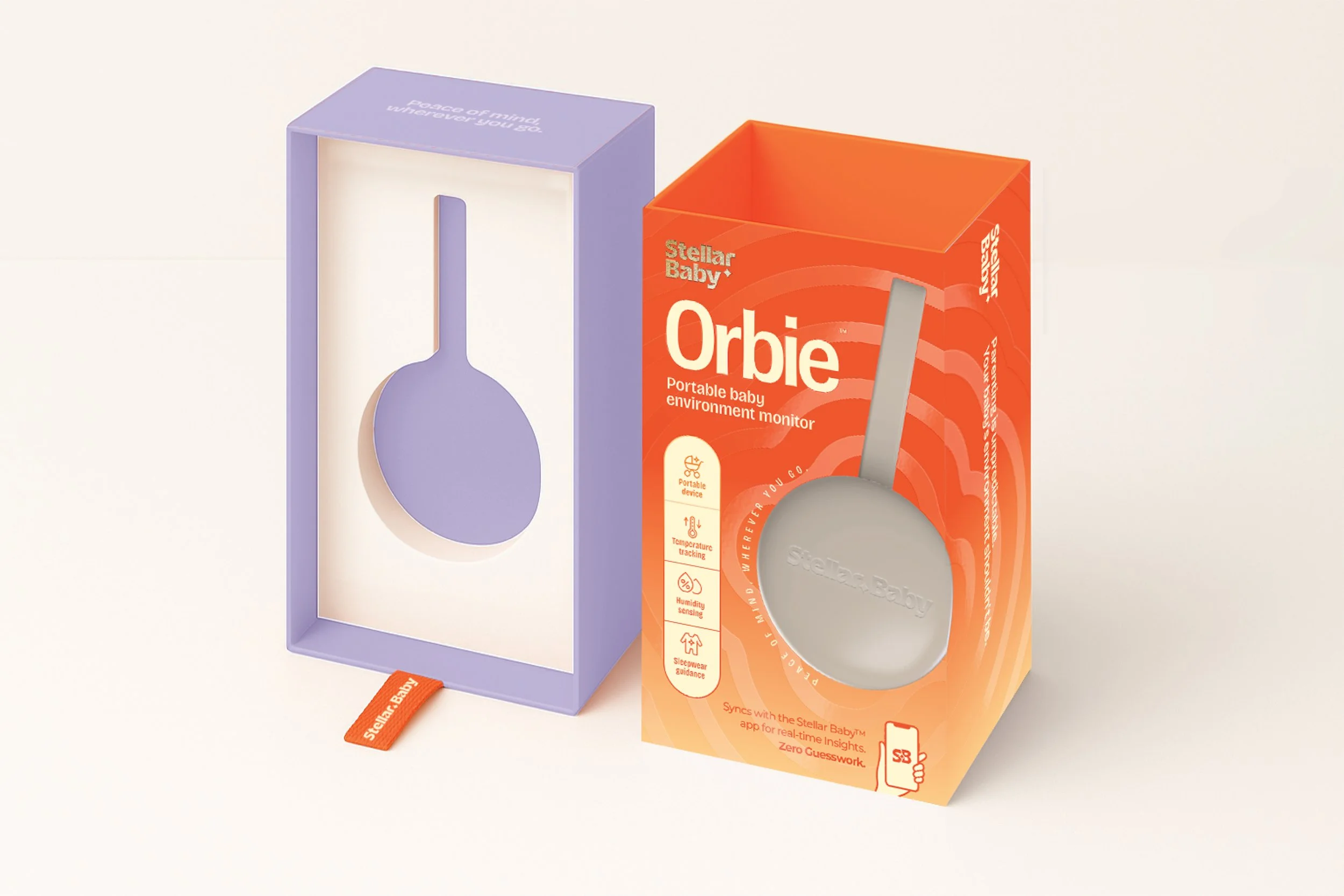
Packaging designed for clarity and confidence
We designed the packaging to make a tech-led product feel easier to understand, more intuitive to engage with, and more emotionally reassuring from the very first touchpoint. Clear hierarchy, confident colour, and a balance of warmth and simplicity helped turn a functional product into something that feels credible, approachable, and genuinely supportive.
A brand built to launch with confidence
Stellar Baby is the kind of project we love most at Quirk. A brand that needed more than a visual identity. It needed a point of view, a personality, and a system designed to support every touchpoint from day one.
From strategy and tone of voice through to identity, digital assets, illustration, and packaging, we built a brand world designed to feel clear, memorable, and genuinely supportive for real parents.
Not just built to look good. Built to grow.