
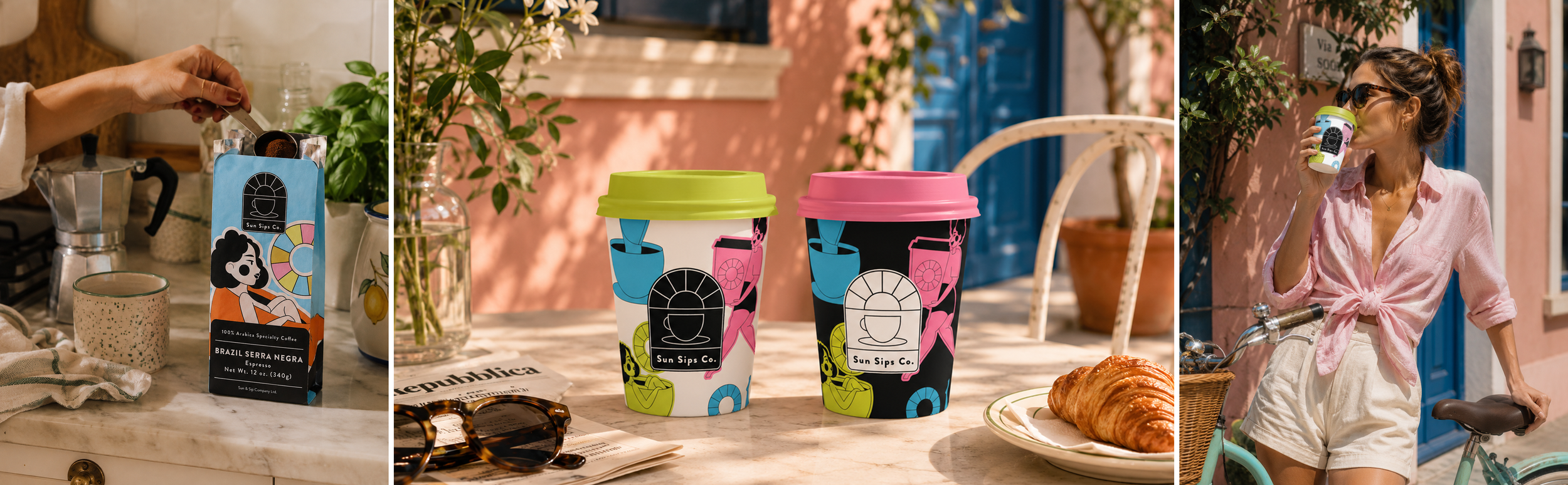
SUN SIPS CO.
Brand Identity · Packaging · Illustration
Coffee with a sunny disposition.
Sun Sips is a playful specialty coffee brand built around the simple pleasure of a really good cup of coffee. Bright, expressive and full of personality, the identity brings a little sunshine to the everyday coffee ritual.

A little sunshine in every sip.
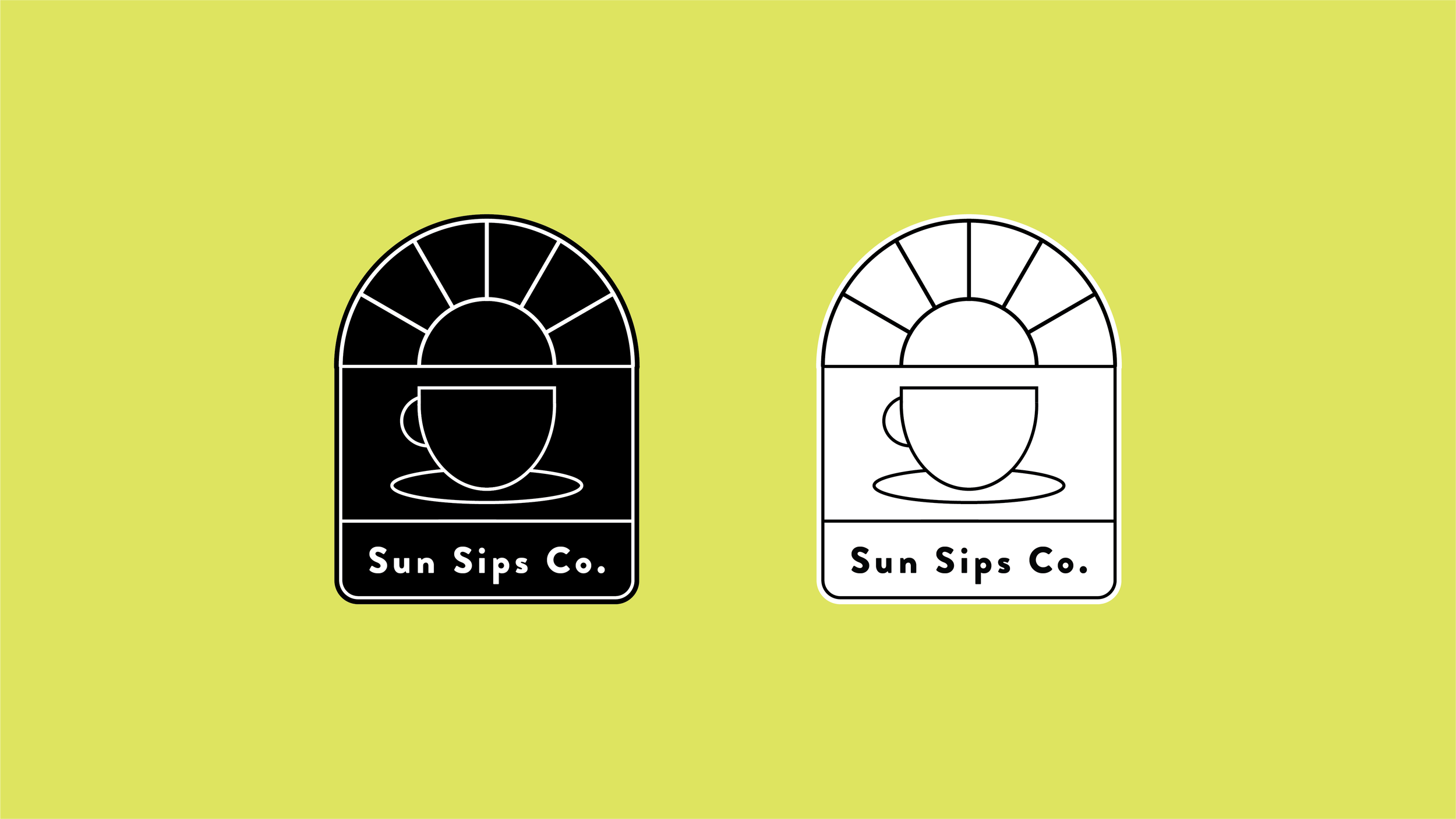
At the heart of the identity is a simple visual idea: bringing together the two things Sun Sips is all about: sunshine and coffee.
The arched logo combines a rising sun with a coffee cup, creating a distinctive brand mark that feels warm, optimistic and instantly recognisable.
SUN + SIPS = ☀️ + ☕
Bright by nature
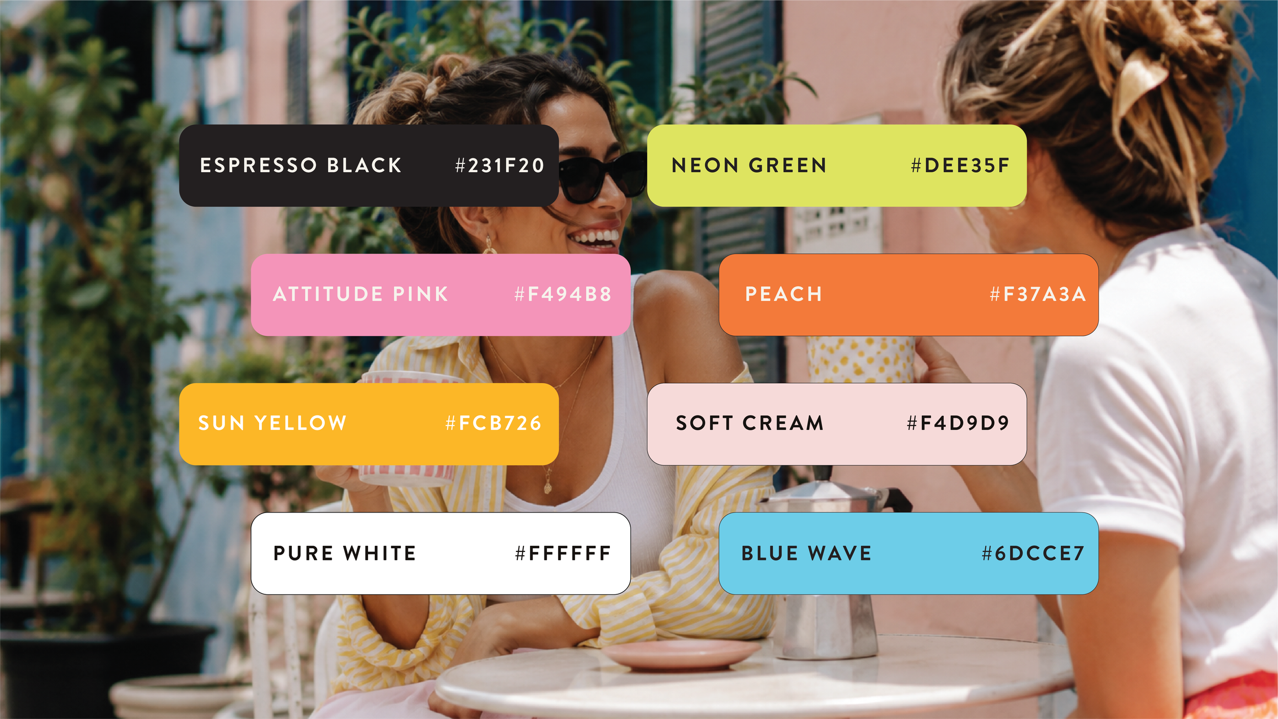
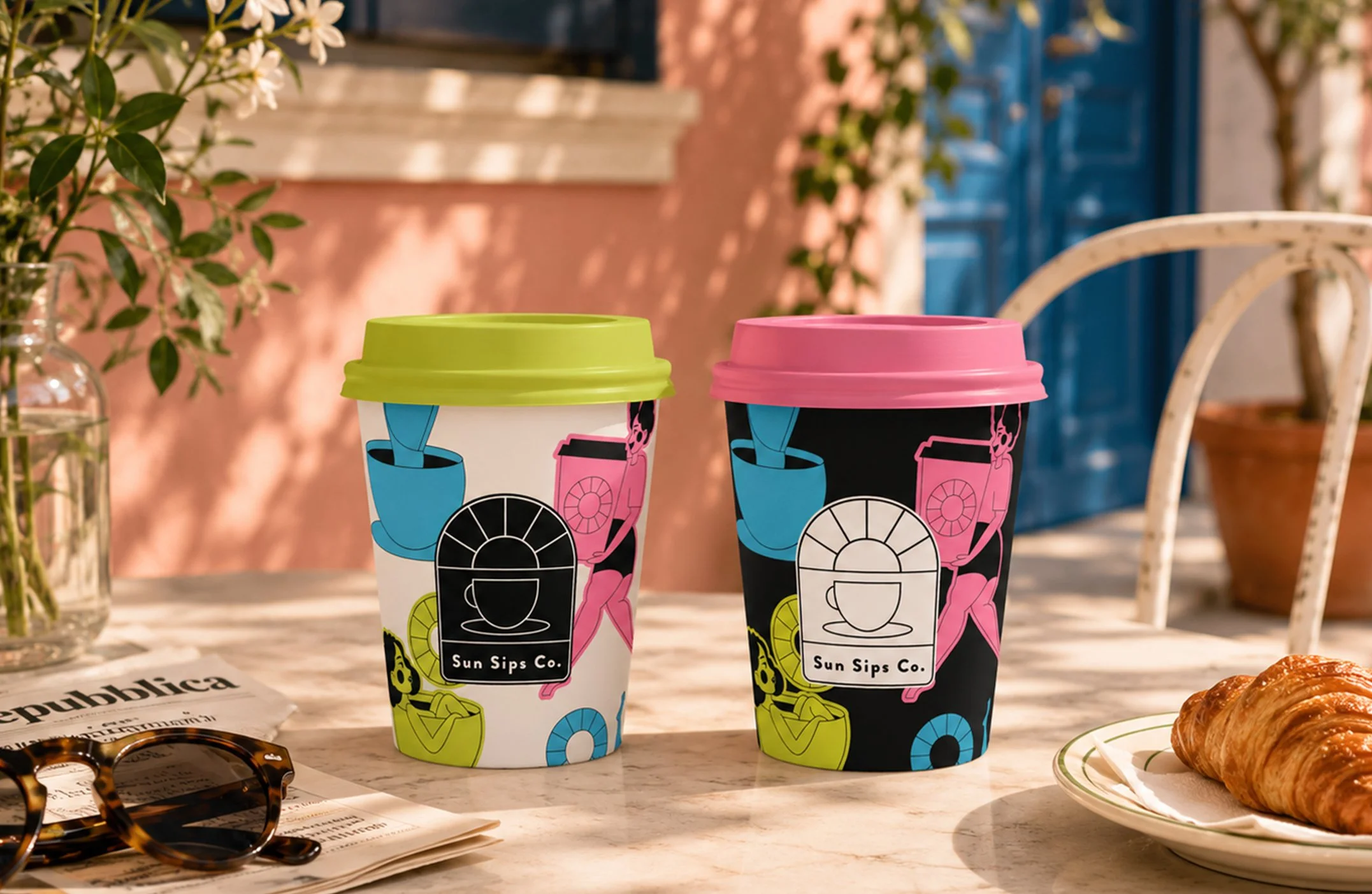
A bold palette of neon green, attitude pink, blue wave, peach and sun yellow creates a brand world designed to feel energetic, optimistic and unmistakably fun, grounded by espresso black and softer neutrals.
Meet the Sun Sippers
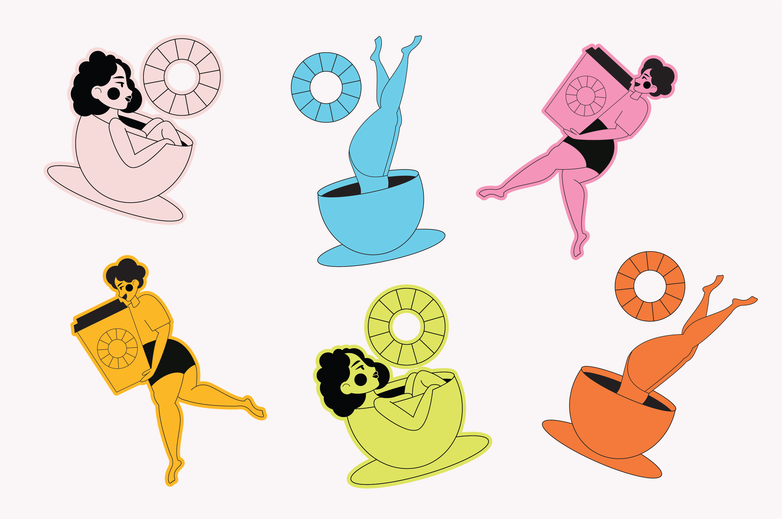
A playful cast of illustrated characters brings the brand personality to life, each one finding their own way to enjoy a cup.
Designed as a flexible library of brand assets, the illustrations can move across packaging, cups, social, merchandise and campaign creative, giving Sun Sips a world that can continue to grow with the brand.
Designed to stand out
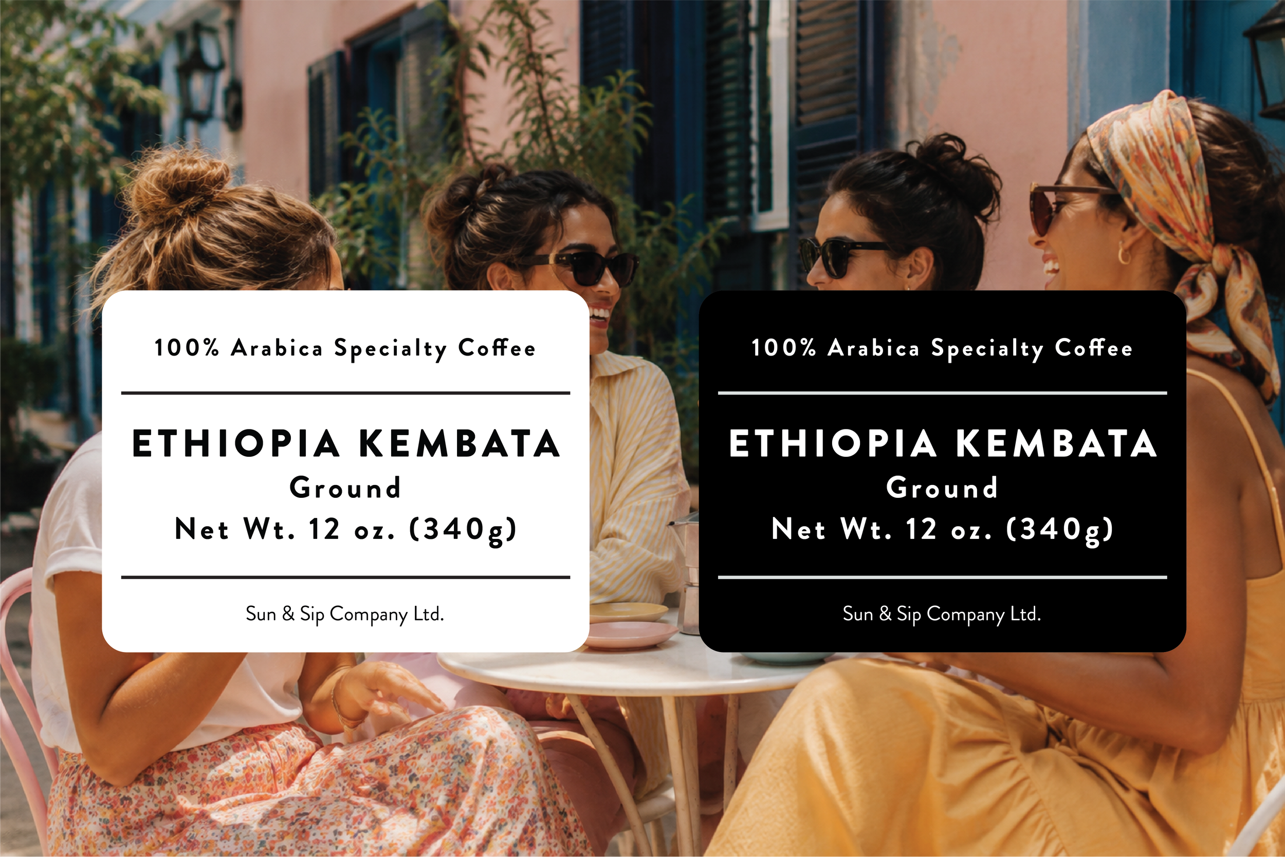
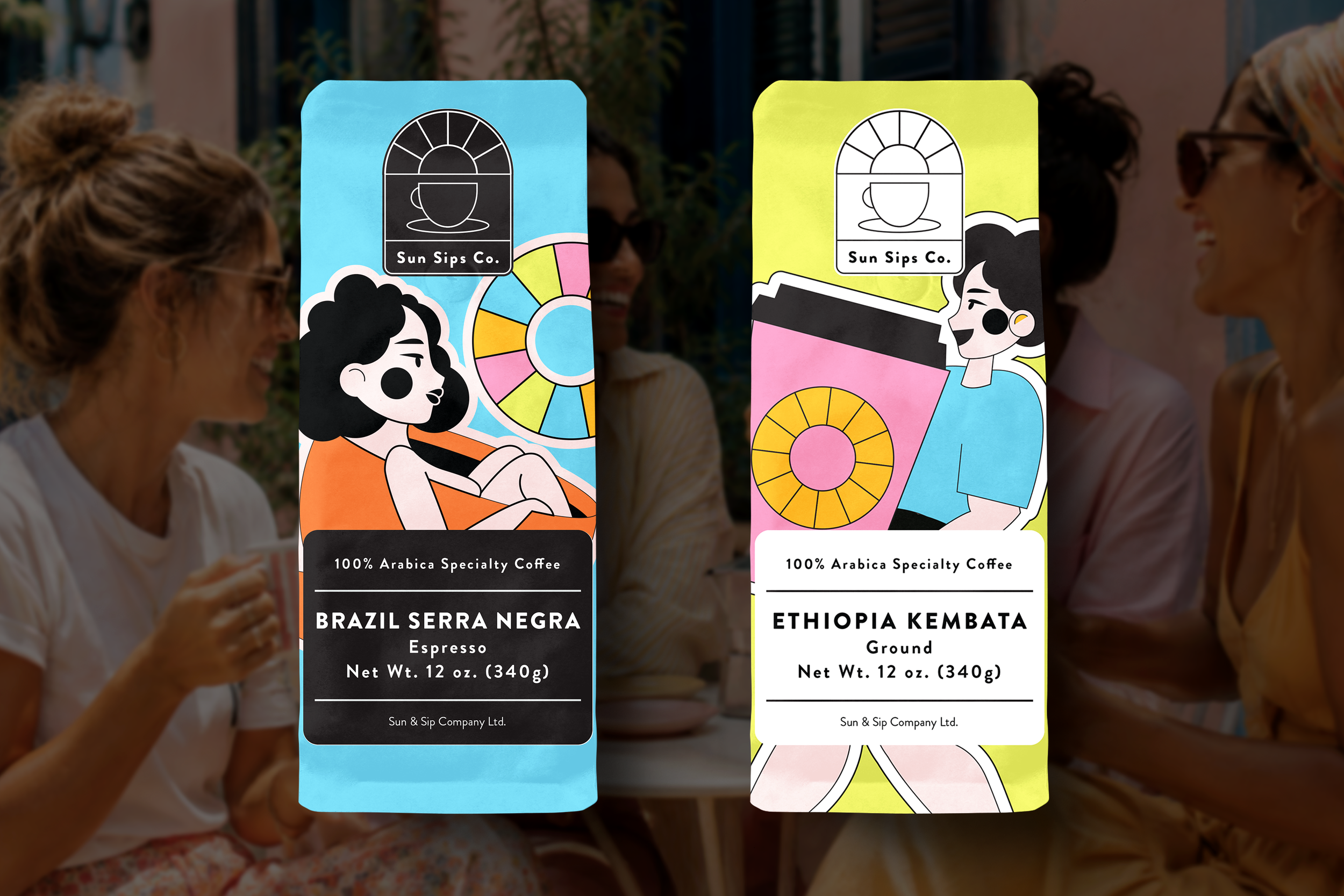
The packaging brings every part of the identity together: bold colour, character illustration, a distinctive brand mark and a clear product hierarchy.
The result is a flexible packaging system designed to create recognition across the range while allowing each coffee to have its own personality.
Have a product ready to stand out?
Let’s create something people notice.