
Ivy Nutra
Supplement Branding & Packaging
Brand Strategy · Brand Identity · Packaging Design · Packaging System · Production Artwork
The Challenge
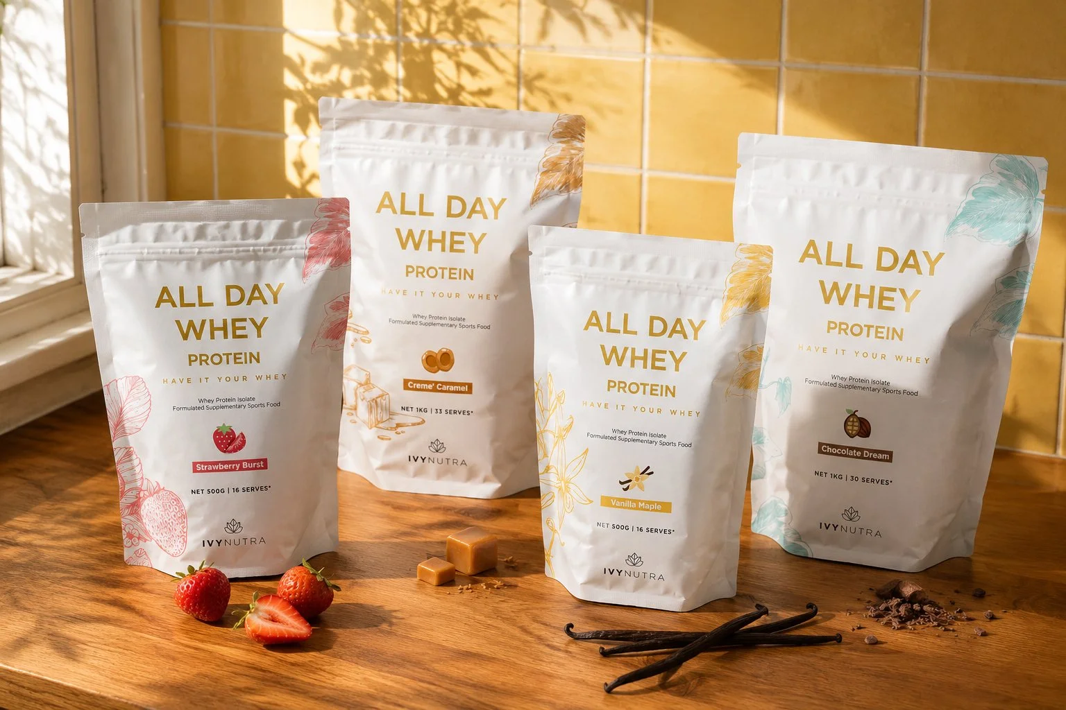
Protein has traditionally been a category dominated by performance cues: bold graphics, dark colours, technical language and brands designed primarily around gym culture.
Ivy Nutra needed to feel different.
The opportunity was to create a supplement brand that still had the credibility expected of a sports nutrition product, but with a softer, more considered identity that could fit naturally into everyday routines. The brand needed to balance performance and lifestyle, science and approachability, clarity and personality, while creating enough structure to grow across products, flavours and future SKUs.

Building the Ivy Nutra Brand
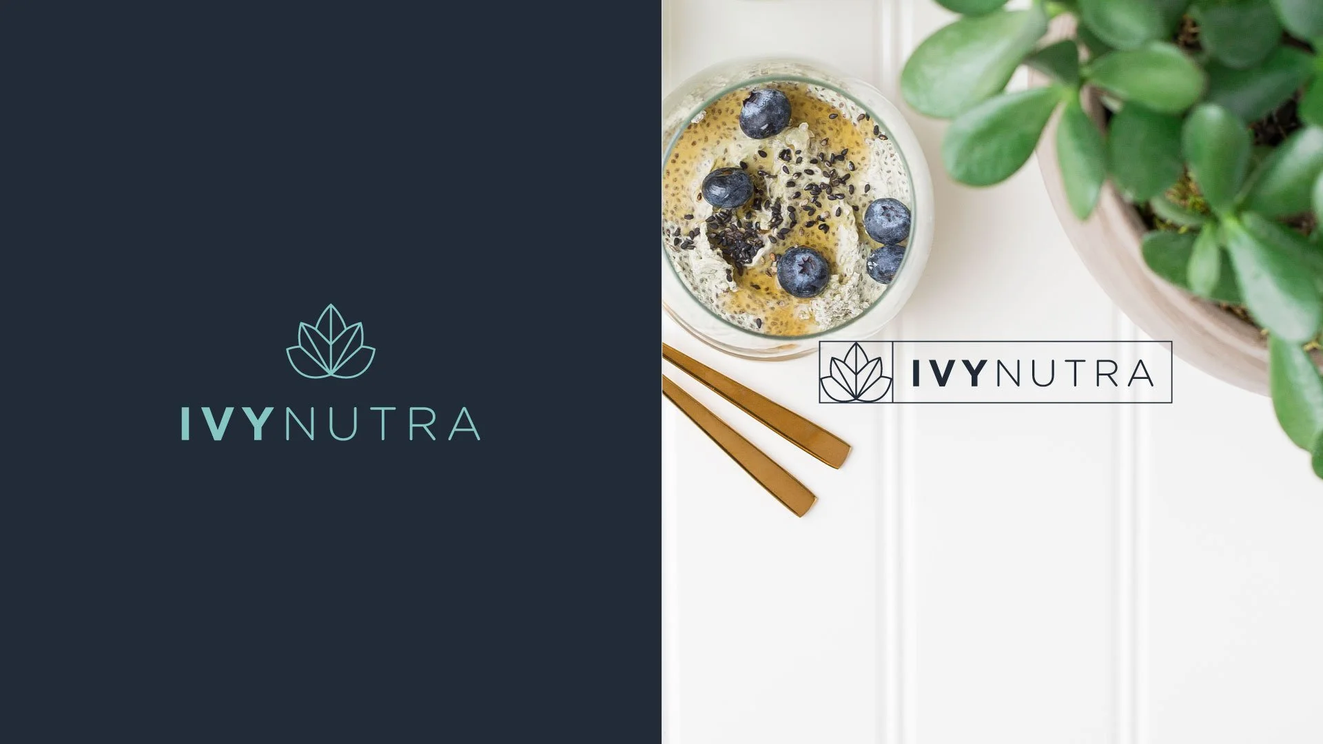
The Ivy Nutra identity was designed around modern wellbeing rather than traditional sports nutrition. At its centre is a geometric botanical symbol, a simplified ivy inspired mark that gives the brand a distinctive asset beyond the wordmark itself.
Paired with clean typography and a restrained colour palette, the identity feels considered, optimistic and quietly confident. The system was designed to work beyond packaging, creating a consistent brand presence across digital, photography and lifestyle applications.

Designing a Scalable Supplement Packaging System
With the identity established, the next challenge was translating it into a protein packaging system that could communicate a significant amount of product information without becoming visually overwhelming.
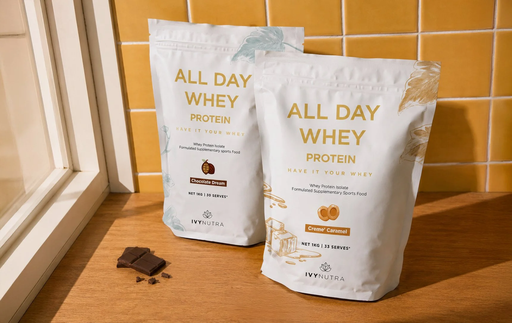
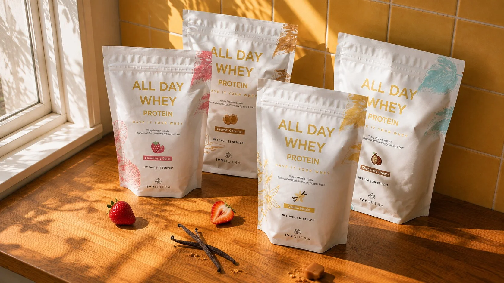
The front of pack was structured around a clear hierarchy, moving from ALL DAY WHEY and PROTEIN through to product information, flavour, quantity and the Ivy Nutra brand. Large typography establishes the product immediately, while supporting information becomes progressively quieter across the pack.
Botanical illustrations bring character and flavour cues into the system without compromising that clarity. The result is a packaging architecture that feels simple at first glance, while providing enough structure to remain consistent as the range grows.
Creating Distinction Across the Range
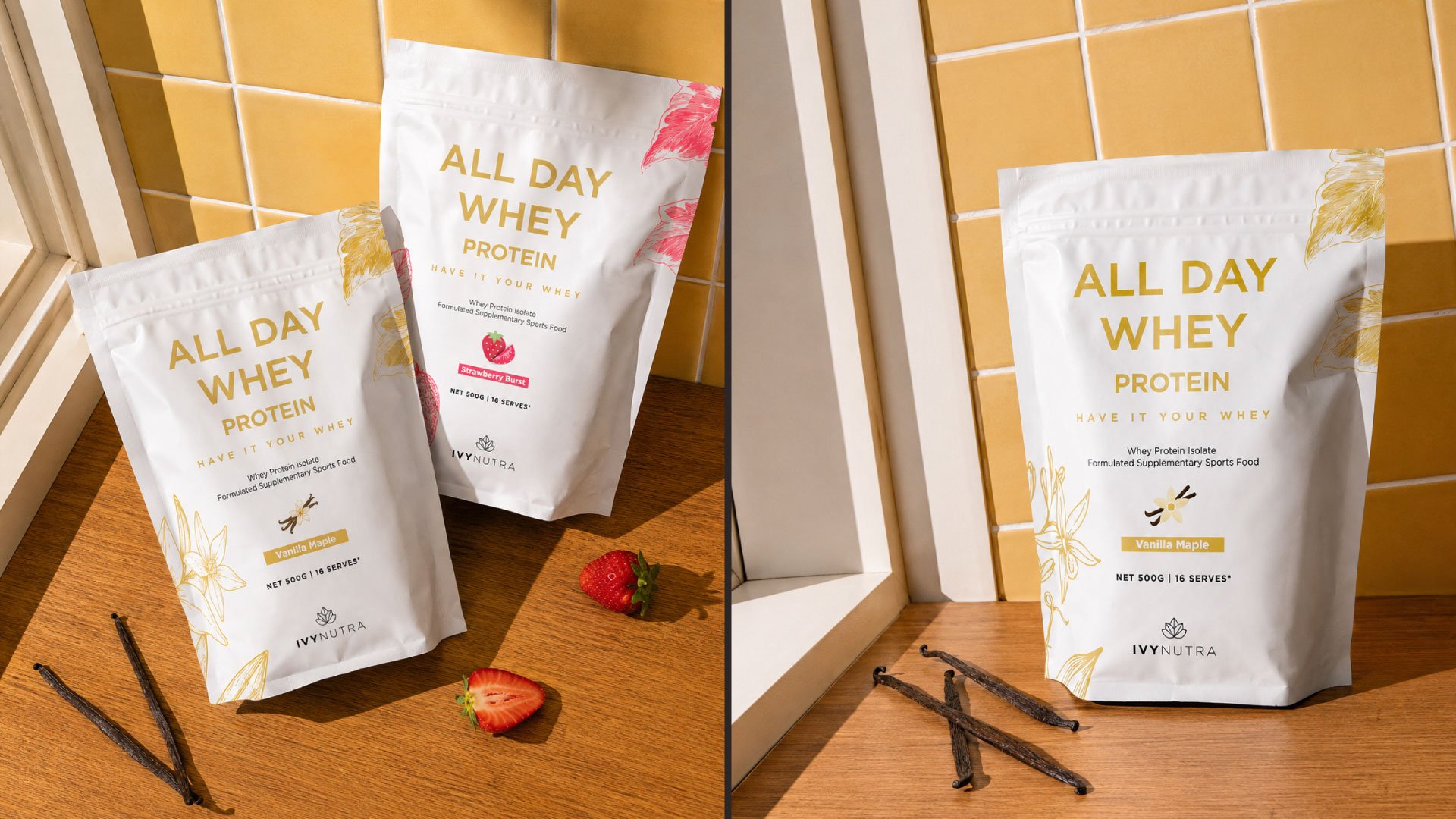
A strong packaging system needs consistency, but that doesn't mean every product should look identical. For All Day Whey, the white pouch became the recognisable foundation of the range, while illustration and colour give each flavour its own personality.
Strawberry Burst introduces fresh pink and red details, Creme' Caramel moves into warmer caramel tones, while Vanilla Maple uses soft golden yellow. The architecture stays consistent while the flavour world changes, making each SKU easy to distinguish while keeping the range unmistakably Ivy Nutra.
One System. Multiple Personalities.
By separating the fixed brand architecture from the flexible flavour layer, we created a scalable supplement packaging system rather than a series of disconnected pack designs. New flavours can develop their own character through colour and illustration without losing the structure that makes the range recognisable.
This gives Ivy Nutra room to grow its product offering while keeping every new addition connected to the same brand.
The Result
Ivy Nutra became more than a protein pouch.
The project created a complete supplement brand, from identity and visual language through to packaging hierarchy, flavour differentiation and production-ready artwork.
A consistent master system gives the brand structure, while colour and illustration allow individual products to develop their own personality.
The result is a sports nutrition identity that feels equally at home in the worlds of performance and everyday wellness, with a packaging system designed to grow alongside the brand.
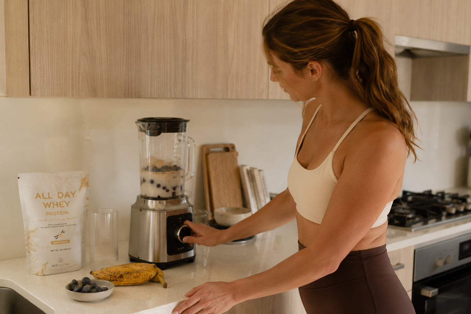
Launching or Refreshing a Supplement Brand?
We create supplement branding and packaging that works as a complete brand, from identity and packaging architecture through to range differentiation and production-ready artwork.
Whether you're launching your first product or building a growing supplement range, the aim is the same: to create a brand people can recognise and a system with room to grow.
Explore Supplement Branding & Packaging