Building Jolly Cannabis from concept to shelf
Jolly Cannabis came to us with nothing but an idea and a bold vision. From there, we built the brand from the ground up, creating a distinctive visual identity, logo, packaging system and campaign-ready creative that turned Jolly into a playful, shelf ready cannabis brand with real personality.


A full brand world, built from scratch
Jolly Cannabis started as a blank canvas. The client came to us with a concept only, so our role was to shape the brand from the very beginning and bring it to life across every touchpoint. We developed the logo, packaging design and flavour-led visual system, creating a playful identity that felt bright, bold and instantly recognisable in a growing category.
From single packs and multipacks to jars and campaign imagery, every element was designed to feel cohesive, flexible and full of personality. The result was a complete brand world that could launch confidently, stand out on shelf and translate seamlessly across product, digital and social.


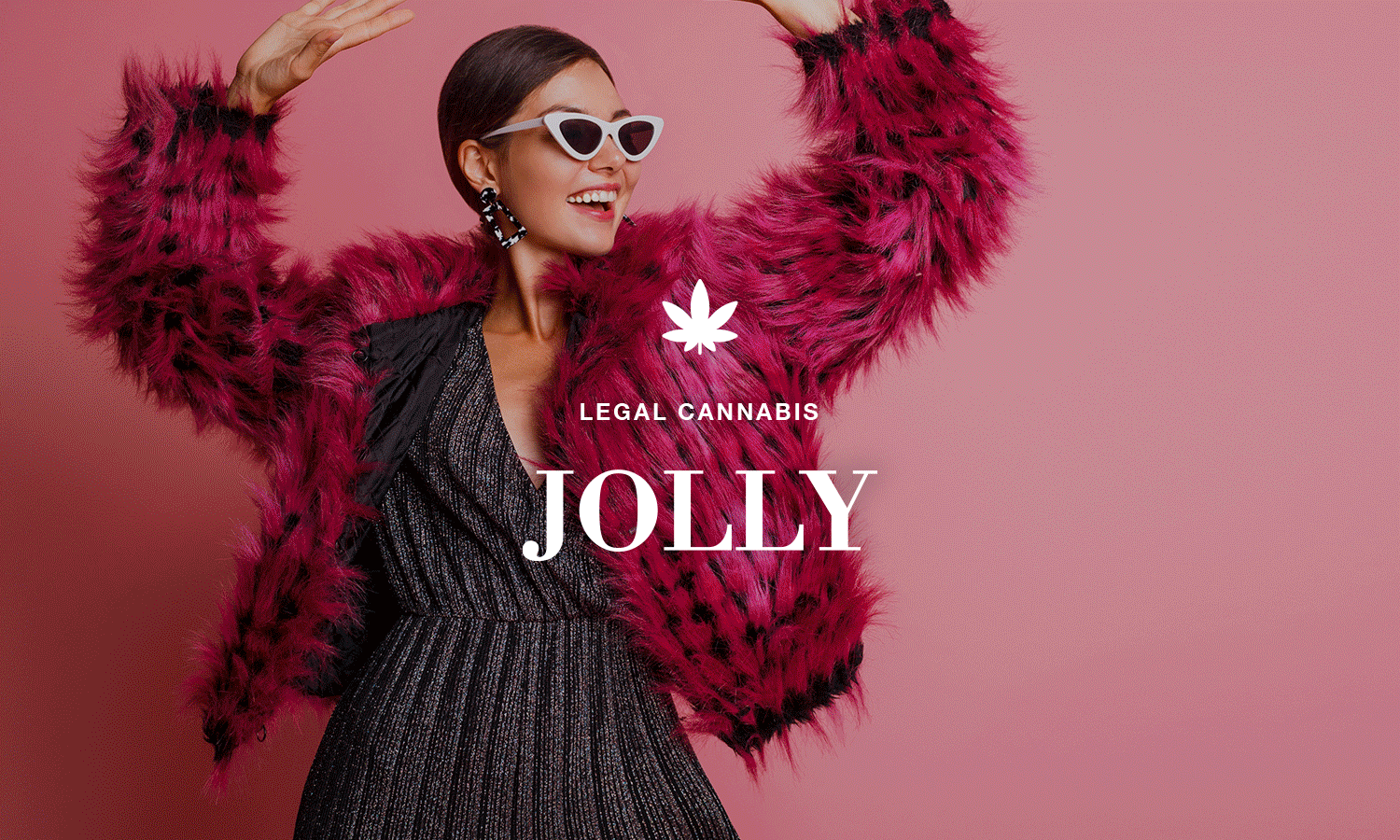
A logo designed to anchor the whole brand
Because Jolly was being built from the ground up, the logo needed to do more than just look good. It had to create instant recognition and set the tone for everything that followed. We created a clean, confident wordmark paired with a simple cannabis leaf symbol, giving the brand a strong foundation that could work across packaging, campaign imagery and future brand extensions.

What we created
We partnered with Jolly Cannabis from the earliest concept stage, creating the foundations of the brand and shaping how it would show up across product and marketing. Deliverables included logo design, packaging design across multiple formats, flavour-led visual direction and campaign-ready brand imagery.